Welcome to My Home
I think a welcome to my home is long overdue! Especially to my kitchen. You’ve been joining me in my happy place for three and a half years and I don’t think I’ve really ever shown you around. It’s changed a bit since I started Cake by Courtney in 2015, so I thought I’d take a minute to show you around our new space. Here’s a look inside the heart of our home: part 1.
We moved to Utah a little over four years ago, not knowing exactly how long we’d be here. I moved around a lot growing up. Ryan and I have also moved around quite a bit in our nearly 14 years of marriage. Since we got married, though, I always told Ryan that I want to plant our feet somewhere long-term before Westin hits middle school. (I moved in middle school and high school and it was not an easy thing for a teenager!) Anyway, last summer Ryan and I decided to make Utah home for the long haul and we built a house we knew we could grow into for years to come.
The Heart of Our Home
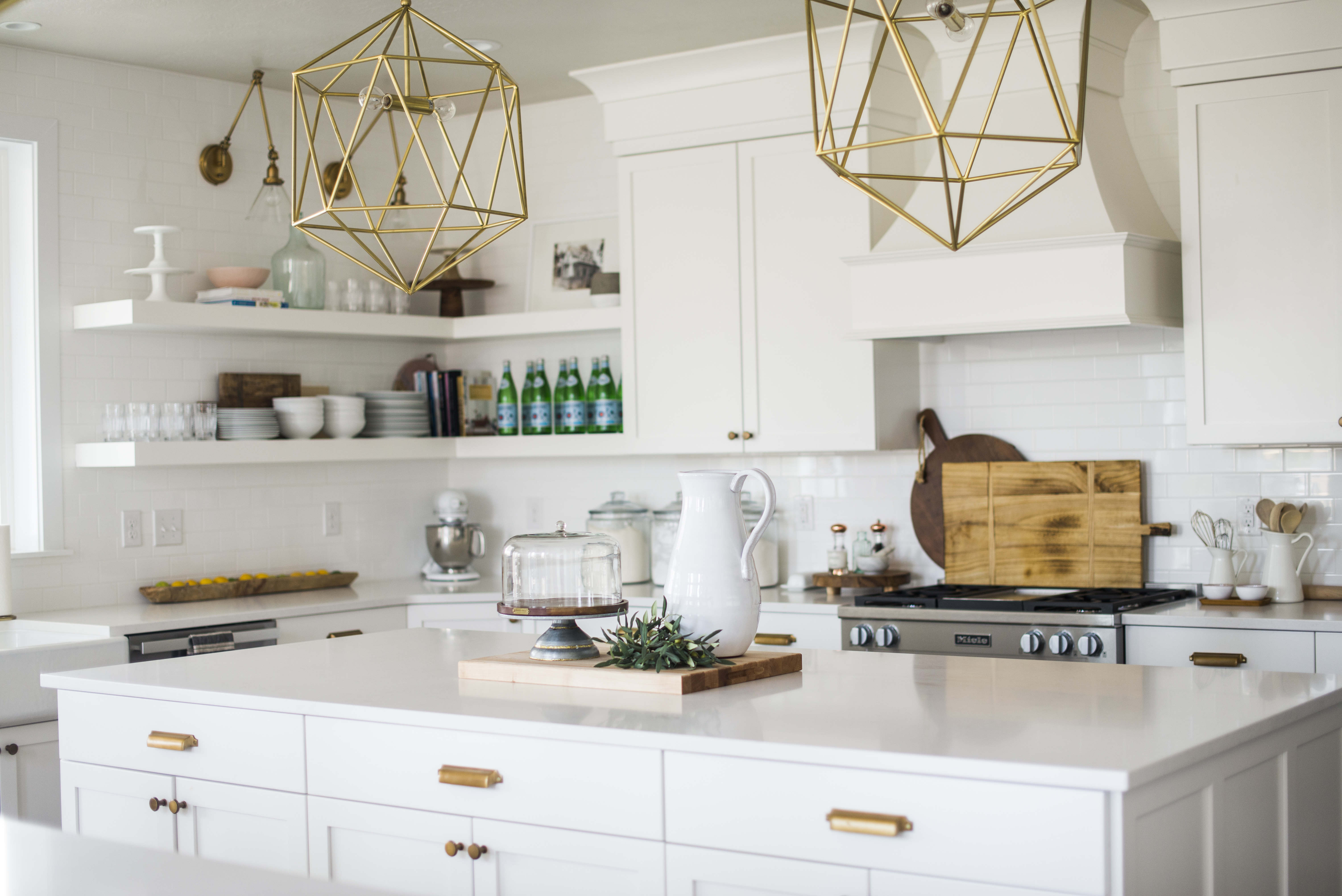
As you’d expect, the kitchen was my main focus when we started our design. In all the homes I grew up in, and in all the homes Ryan and I have lived in, the kitchen has always been the place where my fondest memories come from. From family dinners to parties with friends to school projects and homework, to baking dozens and dozens of cakes, the kitchen is not just a gathering place, it’s my happy place. It’s where I feel the most at peace in my home and in my life. Making our kitchen warm and inviting was so important. You’ll see I went with a lot of white, open shelves (on which we use everything), and a light wall color (Benjamin Moore Classic Grey to be exact) to help create the warmth in our space.
Pendant Lights: Anthropologie (Sold Out) Similar styles: HERE, HERE and HERE.
Kitchen Hardware: Pulls HERE and Knobs HERE.
Kitchen Layout
As we worked on the kitchen design, I wanted to make sure it felt open. I love the “triangle layout.” (That may not actually be the correct term designers use, but I’m gonna run with it.) The idea is that the kitchen, the dining area and the family room create a triangle when you draw lines between them. The spaces feel connected and open to each other. As you walk into our home past the entryway, you’ll find the family room to your left, the dining area straight ahead and the kitchen to your right. So let’s start there… the main kitchen area.
Seating
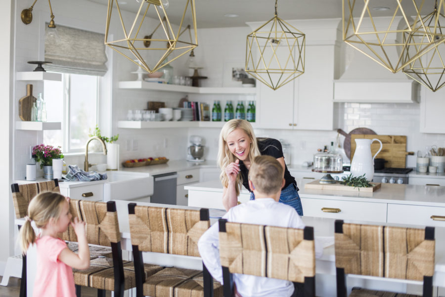
I also decided early on in our building process that I wanted a lot of seating in my kitchen. However, I didn’t want it to feel cramped. We ended up extending our dining area out to allow for double islands: one for food prep and one for seating. In my opinion, this was the best decision we made in our home. The kids can cover one island in homework, school projects, snacks, and art work, and I can stand across from them with an island covered in flour, powdered sugar and cake layers and no one is in each other’s way. More importantly, we’re all in the kitchen together.
Decisions, Decisions!
As easy as it was for me to determine the layout, actually deciding on seating was a whole other story. I would say I’m a bargain shopper when it comes to a lot of items in my home. However, I do think it’s important to find quality pieces, even if they cost a little more, for places in your home where you spend the most time. My kitchen is definitely one of those places. I didn’t want to rush the decision or settle for something I didn’t totally love. In fact, I waited nearly 8 months after we moved in to get my kitchen furniture. As I searched for the perfect kitchen furniture, I didn’t know exactly what I was looking for to be honest. I just hoped that as I scoured the internet, something would just stop me in my tracks.
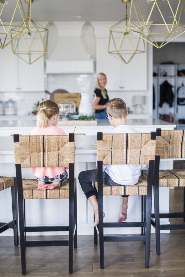
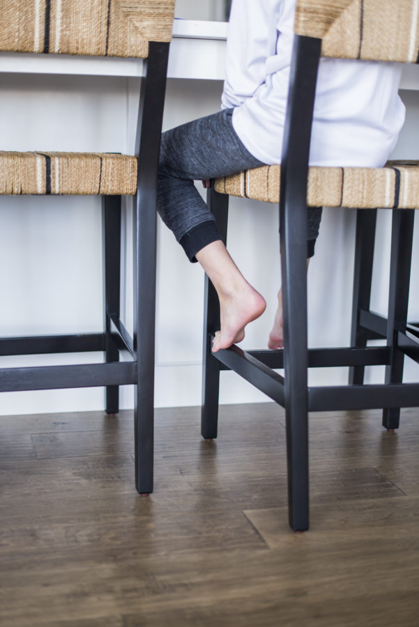
Well, that’s exactly how it happened with my counter stools. After searching and searching for the perfect counter stools with no luck, I found myself on the Serena and Lily site. As I looked through their many gorgeous options, I really did stop dead in my tracks when I saw the Carson Counter Stools. I loved the combination of clean lines, modern colors, and a woven design. It was truly love at first sight! In fact, these stools became the central inspiration for the rest of the decor and furniture in my kitchen. They are in no doubt a statement piece!
I love that we can all gather for a meal, a game or even just chit-chat around the island with plenty of space and lots of comfort.
You can see more of the Serena and Lily Carson Counter Stools, HERE.
I hope you loved this post on a look inside the heart of our home: part 1. There are tons more to share, so check out part 2 of this post right HERE!


What are your kitchen dimensions and how big are your two islands? I love the idea of the double island.
The islands are about 51″ by 105″ on the main island and the eating island is 42″ wide.
I love those light fixtures. They’re so unique! I’m about to start some home renovations and I really like your kitchen – I might be borrowing some things!